
Carpet Color Guide: How to Create a Sophisticated Interior
Carpet is more than a practical flooring material. The right carpet color can define the mood of a space, complement furniture, strengthen brand identity, and make an interior feel more sophisticated. Whether you are selecting carpet for an office, hotel, home, or commercial project, color should be considered together with lighting, furniture, traffic levels, and overall design style.
Here is a practical guide to choosing the right carpet colors for different spaces.
1. Office Carpet Color: Professional and Comfortable
Office carpet should create a professional atmosphere without making the workspace feel cold.
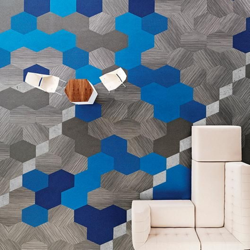
Black, white, and gray are classic choices for modern offices. Gray carpet is particularly practical because it works well with desks, office chairs, and contemporary interiors while helping conceal everyday dirt.
Deep blue and charcoal can create a mature and stable appearance, making them suitable for corporate offices, meeting rooms, and executive areas.
For creative or collaborative spaces, beige, light yellow, or other warm tones can make the environment feel more welcoming and relaxed.
2. Home Carpet Color: Balance Comfort and Personality
Residential carpet allows more freedom for personal preferences and interior styles.
Start by considering the furniture. If your furniture has strong colors or patterns, a neutral carpet can create visual balance. If the furniture and walls are relatively simple, a patterned or colorful carpet can become an attractive focal point.
Warm colors such as soft pink, beige, and muted purple can create a cozy atmosphere, while natural colors such as green, blue, and earthy tones can introduce a calm, organic feeling.
3. Hotel Carpet Color: Match Luxury With Function
Hotel carpet needs to combine visual appeal with practical performance. The color should reflect the hotel’s positioning and complement its interior architecture.
For luxury hotels, deep red, gold, burgundy, and sophisticated neutral tones can create an elegant and premium atmosphere. For modern business hotels, beige, taupe, gray, and blue often provide a clean and comfortable appearance.
In hotel corridors and other high-traffic areas, medium-to-dark colors and subtle patterns can be particularly practical because they help disguise everyday footprints and minor stains.
4. Commercial Carpet Color: Consider Traffic and Branding
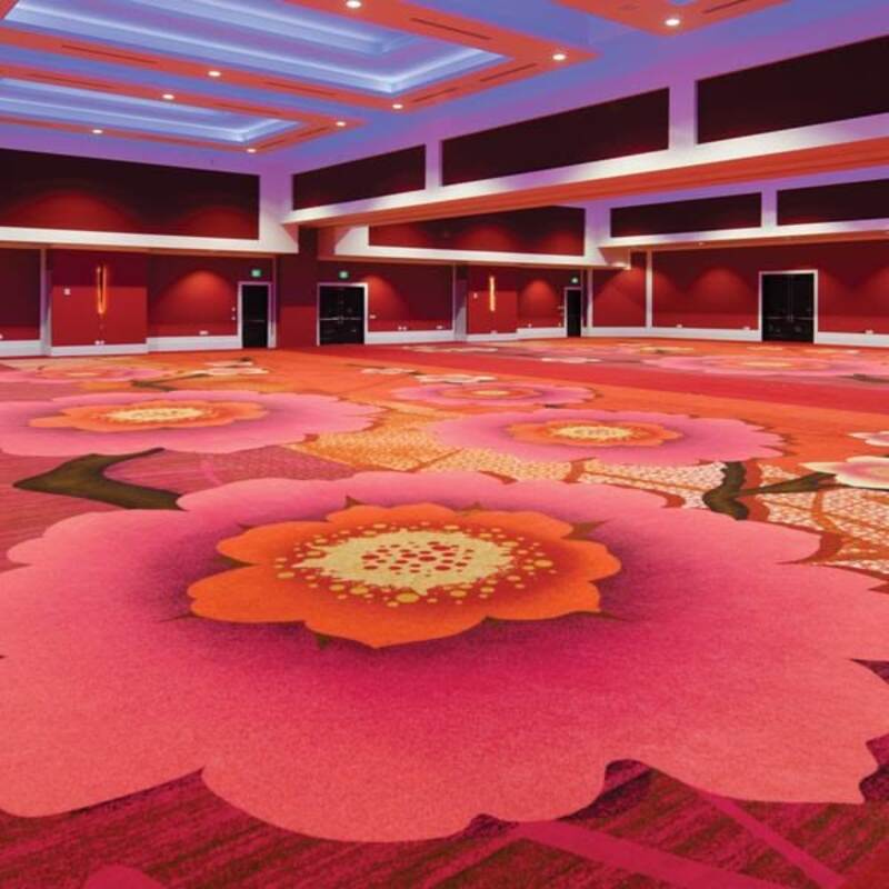
Shopping centers, exhibition halls, retail stores, and other commercial spaces often experience heavy foot traffic. Carpet color should therefore balance durability, maintenance, and visual impact.
Dark gray, brown, and charcoal are practical options for busy areas. For retail environments that need stronger visual impact, brighter colors such as orange or yellow can be used strategically to attract attention.
Brand identity is equally important. A premium brand may prefer elegant neutral or dark tones, while a youthful brand may benefit from brighter and more energetic colors.
How to Choose the Right Carpet Color
A successful carpet color scheme should consider four factors:
- Interior style: Match the carpet with walls, furniture, ceilings, and lighting.
- Traffic level: Choose practical colors and patterns for busy areas.
- Brand identity: Commercial carpet can reinforce a company’s visual image.
- Project function: Bedrooms, offices, corridors, lobbies, and retail spaces have different requirements.
Create a Better Space With Custom Carpet
There is no universally perfect carpet color. The best choice is the one that balances design, functionality, maintenance, and project positioning.
For hotels, offices, retail spaces, and other commercial projects, custom carpet allows buyers to select specific colors, patterns, materials, pile constructions, and dimensions. With the right combination, carpet can become both a functional floor covering and an important part of the interior design.